OWNN
IDENTITY DESIGN FOR THE FIRST PROPERTY LOUNGE IN A BOOMING MUMBAI SUBURB.
Property made simple
Born out of its founders struggle to stand out in an industry marked by sameness and a sense of general mistrust, Ownn is an environment that is seeking to revolutionise the local real estate market by simplifying the property buying experience and making it refreshing and enjoyable for the buyers.
Ownn is a platform. To be successful it needs to function in harmony with a multitude of partner brands. This requires it’s design language to strike a balance between functionality and own-ability.
Taking colour as our main tool we started by creating two palettes.
A minimalistic primary to dominate all the functional touchpoint and a nature inspired accent palette to add vivacity. A signature layout template and a set of patterns derived from the brand symbol become the primary vehicles to bring colour to effective action across different touchpoint.
Together these three elements form the core of Ownn's graphic language.
Be informative and engaging
Be comforting and relaxing
Be believable
Impressions of brand / home / locality create a memorable journey throughout the space
Simple pattern and colour blocking helps to stand out
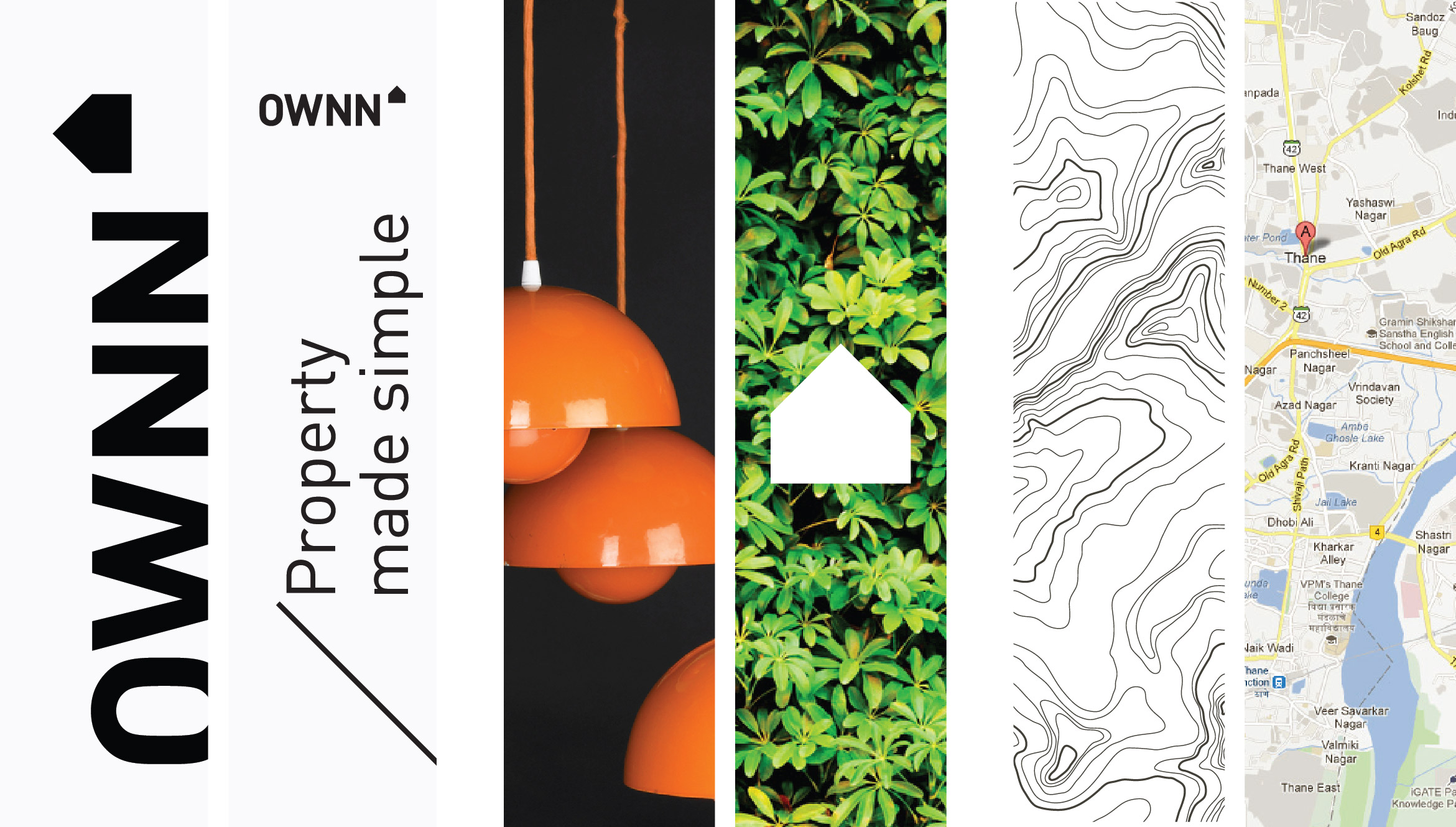
To effectively extend the ‘Ownn’ experience in the space, the key thought was to influence all non-tenanted areas. We focussed on creating ‘Impressions of home and locality’ with the use of photography and the language
of maps.
Agency : FITCH_Mumbai


