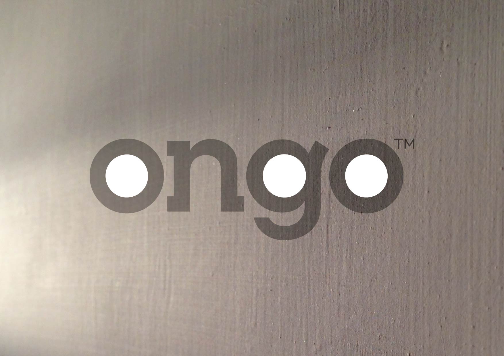
ONGO
NAMING, IDENTITY AND BRAND ARCHITECTURE FOR A WHITE LABEL ATM BRAND.
Money on-the-go
When it comes to providing ATMs, markets across tier 3-6 towns are typically underserved. In order to change this, an end-to-end payment solutions company, is launching Ongo, a white label ATM brand. Starting with the name, we created a high impact brand that communicates in a fun and simple way and is truly ownable. The central tenet of all design being simplicity and trust.
At the centre of the new identity is the Ongo logotype, always set in black against an unconventional colour palette introducing the use of three distinct yet harmonious hues.
Created out of a customised version of Lubalin Graph, the logotype is at the heart of the brand and all it’s applications. This is evident in the brand communications, where the logo is proudly the first word of the message expressing the brand’s confidence and simplicity.
The brand uses two typefaces. ITC Lubalin Graph works as a natural extension of the logo acting as a signature brand element. Contrasting with it is a more functional secondary typeface, Hero.
Ongo give you access to your money not just when you want it but how you want it.
An additional component of the identity is the brand mnemonic.
An embodiment of the active and friendly nature of Ongo.
It originates from the counters of ‘o’, ‘g’, and ‘o’ from the logo itself. Apart from being a graphic shorthand it functions in a variety of interesting ways, both in print
and digital.
Brand graphics not only provide visual standout but reiterate the logo without being repetitive
From the very start of the project we were mindful of the surroundings Ongo would have to eventually live in. Low tier towns hardly ever provide optimal environments for launching a brand. With the real-estate sometimes being reduced down to a single free standing ATM machine, we wanted to use every opportunity to maximise brand visibility.
We created a system of brand graphics consisting of bold crops from the logo, saturated with colour to be applied to the ATM housing modules. Easy to re-create and apply, the graphics help to provide visual standout without being repetitive and uninspiring.
Ongo logotype is at the center of the new identity work
Post the ATM launch, the parent company plans to introduce a variety of innovative solutions under the brand name of Ongo. We created a brand architecture along with naming and identity for the sub-brands. Across the line consistency is achieved through use of the master brand elements. Individual colour schemes are used in tandem with the master colour palette to give each sub-brand a distinct character.
Agency : FITCH_Mumbai


