DHANLAXMI BANK
BRAND IDENTITY REFRESH FOR A FAST GROWING REGIONAL BANK.
Banking for the next generation
For a brand that speaks of stability but symbolises forward thinking, rebranding meant staying true to it’s heritage and core values, while clearly differentiating the offer and brand from competitors. Starting with the name itself we holistically modernised the visual direction for the brand.
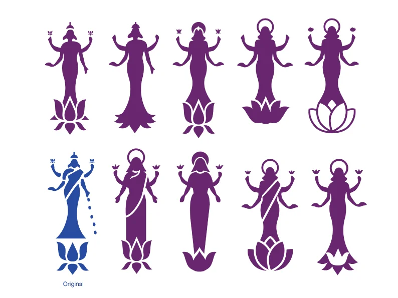
The new brand mark is, in principle, a continuation of the brand's original logo. An update which is in line with the growing customer base and their evolving needs and wants.
The primary brand colour is purple. Amongst competitors it is a breath of fresh air, and symbolises an evolution of India’s banking market. Cyan plays the role of an accent colour.
The typeface, ITC Avant Garde Gothic is chosen for its legibility, robustness and distinct style.
As trust is a key driver in financial services, the fact that the bank was founded in 1927 was a clear opportunity and as such ‘Established 1927’ became not just a strap line for the bank but also an integral part of the new logo.
The outcome is a brand that is modern, confident and open. It avoids ambiguous corporate messages and instead engages customers using their language.
To deliver the refreshed brand direction at retail, a set of photographs were shot.
Each picture with the accompanying message is aimed to celebrate the brand vision and inspire customers.
Thereafter, the new identity was applied to a variety of touch-points across the network.
““The new identity reflects the bank’s growth aspirations in the context of the evolving demographics of young India. We are now aligned to the attitudinal position of today’s youth – modern yet rooted in tradition”
”
Agency : FITCH_Mumbai


